
A beautifully planned kitchen rarely depends on one standout feature. It is the relationship between the cabinetry, worktop, handles, tap, appliances and lighting that makes the room feel calm, considered and unmistakably yours. Learning how to coordinate kitchen finishes is therefore less about matching every surface and more about creating a clear visual order.
That order matters particularly in a kitchen, where practical choices are highly visible. A brushed brass tap may look inviting beside warm oak cabinetry, yet feel disconnected if every other metal is polished chrome. A dramatic stone worktop can bring a room to life, but it needs quieter surrounding finishes to avoid competing for attention. The most successful schemes make each decision feel intentional.
Start with the kitchen’s overall character
Before choosing samples, decide how you want the room to feel. This is not simply a choice between traditional and contemporary. Consider whether you are drawn to a soft, layered country kitchen, a tailored modern space with strong lines, or a design that combines period character with cleaner contemporary detailing.
A Lakeland home with exposed stone, beams or a garden view may suit a palette that takes its cue from the landscape: painted cabinetry, natural timber, tactile stone and aged metals. In a newer property, flat-fronted cabinetry, fine-grained worktops and restrained detailing can create a more architectural result. Neither approach is better. The key is ensuring that the finishes support the same design direction.
Choose two or three words to guide decisions, such as warm, tailored and natural, or crisp, understated and contemporary. If a proposed finish does not fit those words, it may still be attractive, but it is unlikely to belong in the same scheme.
Build the scheme around the largest finishes
Cabinetry, flooring and worktops occupy the greatest visual area, so they should be selected before smaller details. These are the finishes that establish the kitchen’s colour temperature, contrast and level of texture.
Let cabinetry set the tone
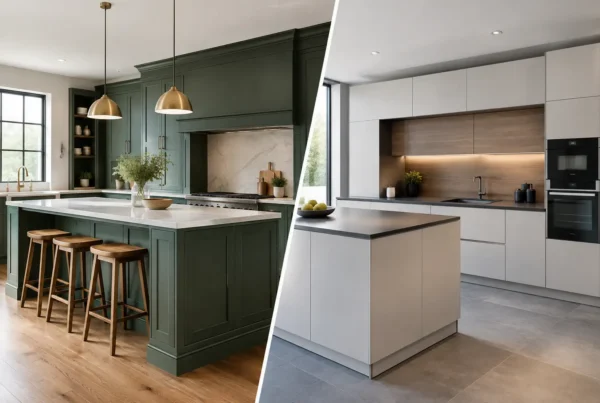
Cabinetry is often the starting point. Deep greens, blues and charcoals create depth and work especially well in larger rooms with good natural light. Softer neutrals, including warm whites, mushroom shades and muted greys, bring an easy elegance and can make compact kitchens feel more open.
Pay attention to undertones. A cool grey door beside a creamy, yellow-based worktop can look accidental rather than layered. Similarly, a stark white cabinet may make a warm timber floor appear overly orange. Compare samples in the room itself, at different times of day, rather than relying on a showroom impression alone.
For a two-tone kitchen, treat one colour as the foundation and the other as an accent. A darker island with lighter perimeter cabinetry is a classic arrangement because it anchors the centre of the room. Alternatively, a timber feature unit can add warmth to a painted kitchen without overwhelming it.
Choose worktops for balance, not drama alone
Worktops need to work hard visually and practically. Natural stone and stone-effect surfaces can offer movement, veining or texture, while quieter worktops provide relief in a room with detailed cabinetry, patterned flooring or a statement splashback.
If you love a boldly veined surface, allow it to be the hero. Pair it with plainer cabinet doors and a simple splashback in a related tone. If the cabinetry is richly coloured or timber-led, a softer, less patterned worktop can prevent the room from feeling busy.
It also helps to think about sheen. A high-polish surface reflects light and feels more formal, whereas honed, matt or lightly textured finishes tend to feel more relaxed and forgiving in family kitchens. This is a practical consideration too: some finishes show fingerprints, water marks and crumbs more readily than others.
Treat flooring as part of the palette
Flooring is sometimes chosen late, which can make it harder to coordinate. Timber, porcelain, natural stone and luxury vinyl all bring different levels of warmth, pattern and variation.
A timber floor should sit comfortably with any timber cabinetry or open shelving, but it does not need to match exactly. In fact, identical wood tones can make a room look flat. Aim for a shared undertone instead: pale oak with warm greige cabinetry, for example, or darker smoked timber with inky painted units. With tiled floors, consider the grout as part of the finish too. High-contrast grout creates a graphic look; a blended grout is quieter and more enduring.
Coordinate metals with purpose
Metal finishes bring the scheme together because they appear at eye level and at hand level: on handles, taps, hinges, lighting, sockets and shelving brackets. They deserve more thought than simply choosing what is fashionable.
One dominant metal finish will usually give the most polished result. Brushed brass brings warmth and works beautifully with off-whites, greens, timber and natural stone. Brushed nickel is versatile, refined and particularly suited to softer grey or blue schemes. Black can add definition to modern kitchens, though it is strongest when echoed in other details such as lighting frames, window furniture or appliance trims.
You can mix metals, but do so with a reason. A warm brass tap and handles may sit alongside black pendant lights if the black is used sparingly as a framing element. Avoid mixing several unrelated finishes in small quantities. The effect can feel piecemeal, especially once appliances and everyday objects are introduced.
Do not overlook sheen. Polished chrome, satin nickel, antique brass and brushed brass are not interchangeable versions of the same colour. Their reflectivity changes the mood of the space. When comparing samples, place the handle, tap and light fitting together rather than making each decision in isolation.
Use texture to add depth
A kitchen with every surface in the same smooth finish can feel cold, even when the colours are right. Texture is what gives a restrained palette character. Fluted glass, timber grain, honed stone, handmade-look tiles and woven stools can all add interest without demanding another colour.
The balance is important. If the cabinet doors have a strong grain, the worktop and splashback may need to be calmer. If you choose a rustic, handmade tile, keep the surrounding finishes tailored. Texture should create a sense of richness, not visual noise.
This is especially useful when working with a neutral kitchen. Instead of introducing several competing shades of beige or grey, combine a painted matt cabinet finish with a veined worktop, timber accents and softly brushed metalware. The room will feel layered while remaining restful.
Plan the splashback, appliances and lighting together
A splashback is not an afterthought. It sits directly between cabinetry and worktop, where even a small mismatch is noticeable. Continuing the worktop material up the wall creates a refined, cohesive look, particularly with stone or quartz. Tiles offer more texture and personality, but choose a tile that responds to either the cabinet colour or the worktop rather than introducing an entirely separate palette.
Appliances need to be considered early too. Integrated appliances allow cabinetry to take centre stage, while stainless steel, black glass or range cookers become visible finishes in their own right. A large stainless-steel cooker may suit brushed nickel handles and a cooler, more professional feel. A black range can help anchor darker hardware or lighting.
Lighting completes the picture. Decorative pendants over an island can be a finish in themselves, while under-cabinet lighting reveals the true colour and texture of the worktop and splashback. In a kitchen used from breakfast through to evening entertaining, layer task lighting with softer ambient lighting so the materials remain flattering at every hour.
Test samples in the real room
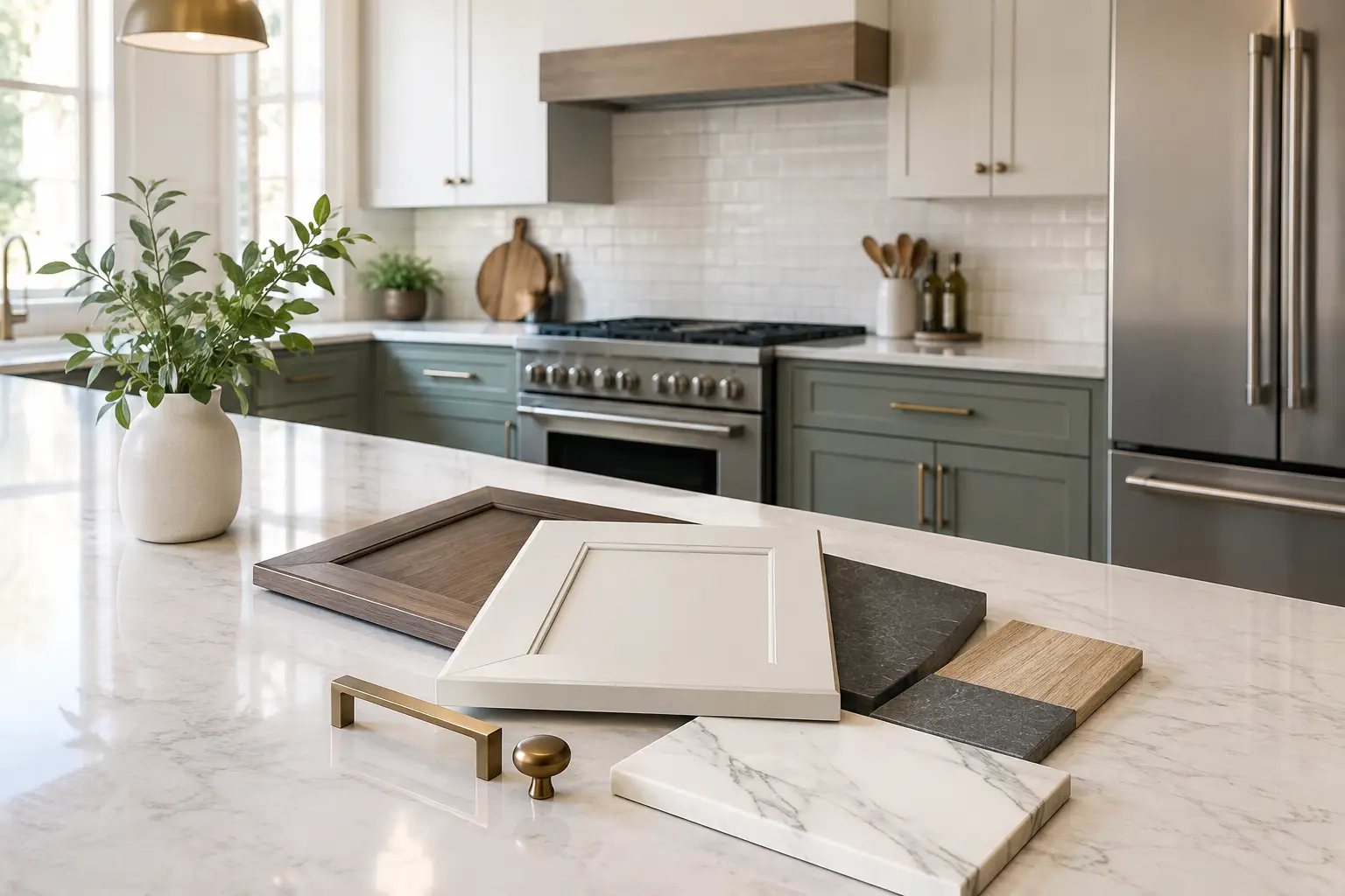
The most reliable way to avoid expensive surprises is to view samples together in your own kitchen. Daylight in Cumbria, the Lake District or Northumberland can be changeable, and a finish that looks warm under showroom lighting may appear much cooler at home.
Place cabinet, worktop, flooring, tile and metal samples next to one another. Look at them in morning light, on an overcast afternoon and with your proposed artificial lighting switched on. Stand back, then look closely. Ask whether there is enough contrast between adjoining materials and whether any undertone suddenly looks wrong.
This process also reveals practical concerns. A pale matt handle may show marks more readily in a busy household. A heavily textured splashback may require more care behind a hob. Luxury should suit the way you live, not ask you to work around it.
Keep the final edit disciplined
Once the principal finishes are chosen, resist adding a new idea to every corner. Open shelving, bar stools, window dressings and accessories should reinforce the kitchen’s central palette. A room feels expensive when it has been edited with confidence.
At Lakeland Bespoke Interiors, the design process brings these choices together before fitting begins, so the details are considered as part of one complete room. Bring inspiration, but also bring an open mind: the finest combination is often not the one that matches perfectly, but the one that gives every material space to shine.
A well-coordinated kitchen should feel settled from the first day and still reward a closer look years later. Start with the materials you genuinely enjoy living with, then let proportion, light and thoughtful restraint do the rest.